Tiger handcream (2021)
client: Designcoop

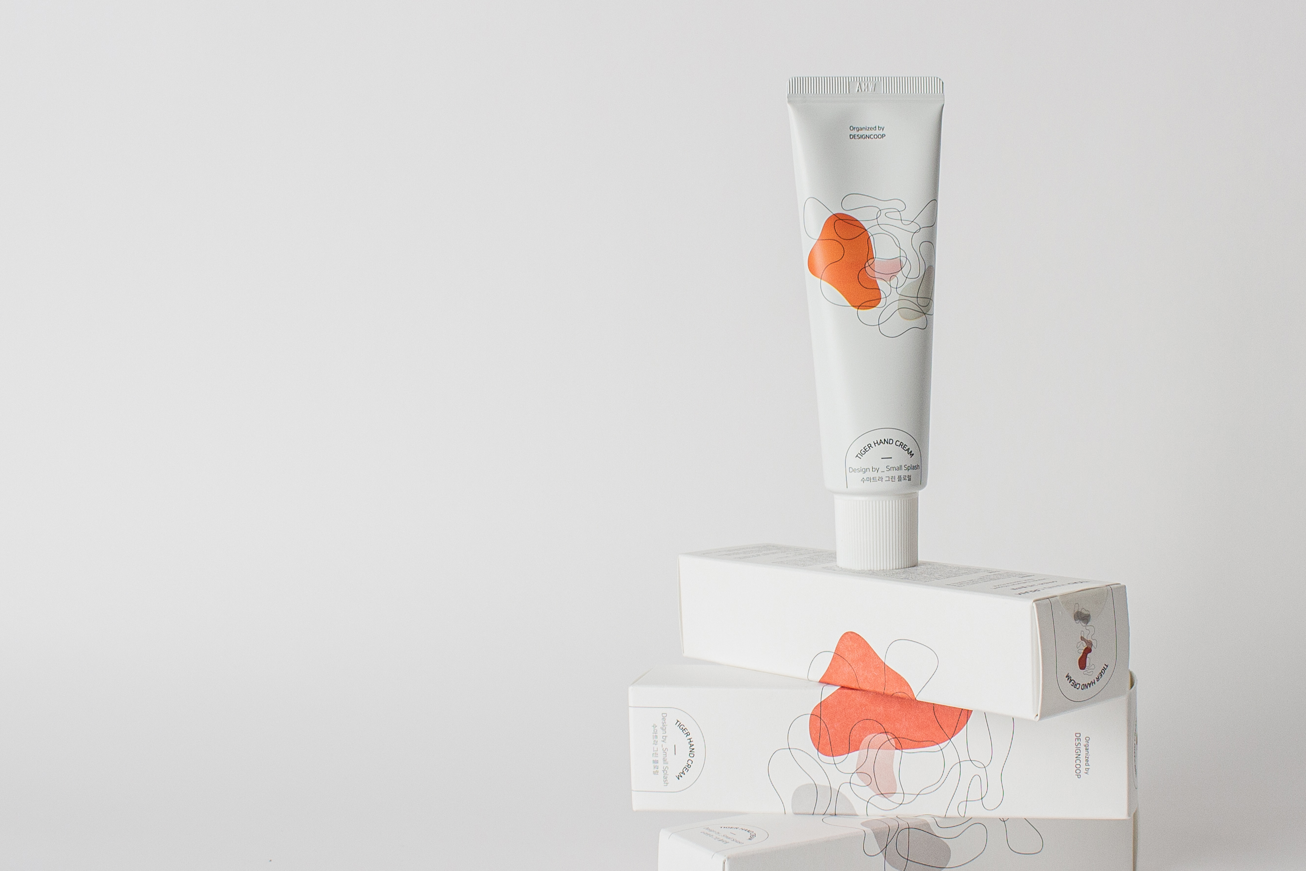
"호랑이"라고 표기되는 한글 기호를 유기적으로 변형하고 재배치하여 "호랑이 얼굴"를 형상화할 수 있는 선을 만들었고,
"호랑이"를 연상할 수 있는 색을 면으로 배치해, 선과 면을 조화롭게 해서 "호랑이 그래픽"을 디자인했다.
The Korean symbols marked "호랑이" were organically modified and rearranged to design a line that "Tiger face"
and colors reminiscent of "Tiger" were arranged in plane. "tiger graphics" were design by harmonizing lines and plane.